ARAUCO recieves international award For its new corporate identity
Corporate

The company was recognized with the CLAP international award in the “Best corporate identity system or branding” category.
In late August, the company presented its new image, which was the result of thorough work conducted for over a year and a half. Thanks to this process, the international organization “VEREDICTAS” –responsible for the CLAP awards—honored ARAUCO for the first time.
The award recognizes the brand’s closeness and differentiation brought forth by a universal language. In addition, it highlights the typography and colors which differ from the classic shades of green used by the industry.
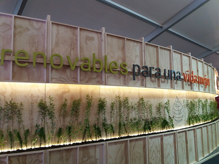
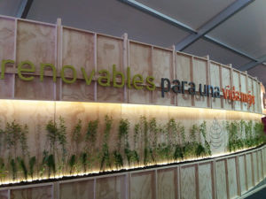
This renewal aims to express the company’s evolution in over 40 years in operation in Chile and the world, under the concept “Renewables for a better life”. This visual identity is the result of profound work conducted with the guidance of branding agency Procorp-SAFFRON.
Charles Kimber, Senior Vice-President of Commercial & Corporate Affairs at ARAUCO stated: “This award makes us proud of the work that’s been done, and places value on the closeness and differentiation that the new identity provides us as a company. This new visual system allows us to engage with our stakeholders in a way that’s different and more personalized. This is, undoubtedly, a global brand for the competitive scenarios in which we operate and where we project ourselves today”.
“We are a company that aims to be outstanding and positively differentiate ourselves, sustainably increasing our competitiveness. We want to express this intention in our visual identity”, he added.
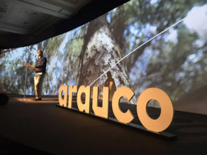
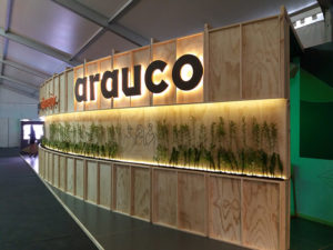
Today, the company’s visuality has a new logo, which no longer includes the pine tree that accompanied ARAUCO for years, yet this symbol reappears as a highlighted element of the visual identity, in addition to a new language and colors.
The typography uses lower case letters that are exclusive, robust and unique, expressing more closeness and a style that relates the company to the world of architecture and design. The brand has a contemporary character; its color and the shape of its outline are reminiscent of wood, suggesting the geometry seen on wood cuts, the source of all the company’s products.